Empathy is the ability to understand and share the feelings of another, to imagine what he or she might be thinking or feeling. In today’s digital world, empathy is a severely underused (if not completely unused) life skill. It’s something that we are taught at a young age that seems to slip away as we grow up. And it’s thinking shows up when we are building and marketing on the web.
When it comes to creating online experiences, we are far more adept at creating something that aligns with our own experiences than considering the behaviors and limitations of our target audience. What may seem obvious to you, may be confusing or frustrating to your potential customers. Confusion and frustration are not conducive to a nice web experience.
What is empathy? And how does it fit with your website and SEO?
As an SEO, we tend to get so caught up in only thinking about — and reacting to — what Google is telling us. It is so ingrained in us to be chasing those top spots for our clients and bosses that we’ve gotten away from what our true objective should be, which is to provide the best answer to a person’s question, and to help them quickly and easily access the information they’re after.
So how do we, as digital marketers, incorporate an empathetic approach to include our entire audience, while keeping the Google bots happy?
If we consider that Google’s mandate is to answer all life’s questions and solve problems for its users, then providing the best possible experience for everyone regardless of device, location, or cognitive ability is paramount.
And how does Google go about getting webmasters to adopt these practices? By incentivizing these features and making them part of Google’s ranking algorithm.
First things, first: Mobile-First
When it comes to empathizing with your audience, consider your mobile experience and how users interact with it. Make that mobile experience top-notch. Since Google has moved all websites to mobile-first indexing, delivering a speedy, streamlined experience across mobile devices will let your site shine.
If you want to create a positive experience and compete for visitors from Google, here are some quick tips for you:
- Keep away from autoplay videos – especially if they are playing in the background
- Make image files small – keep them under 100kbs
- Prioritize content – put the most important information right at the top
Which leads us to the next tip: Make it easy for your visitors to find the information they’re after.
- One topic per page: (example: woodworking shop — cabinetry, dining tables, bed frames – this will help manage keyword cannibalization)
- Make it scannable – headers, paragraphs, bullet points all breakup monotonous content
- When it comes to navigation menus, don’t try to reinvent the wheel – keep a consistent layout across all of your pages
Low WiFi Connectivity
If you’ve never left the confines of the city and ventured into the wilderness and experienced a slow connection while trying to use Google Maps for directions, then you haven’t truly lived. But for many around the world (including North America), that’s an everyday occurrence. Trying to access information on the web using a slow WiFi connection is as unproductive as it is painstaking.
Between Canada and the USA, 19% of the population lives in rural areas. With many of these areas under-served by telecom and internet companies. There is a large number of households still using dial-up to access the internet. Let that sink in for a minute.
So, in addition to the above tips, consider:
- Use a Content Delivery Network (CDN) for images
- Minimize your use of overly-complex design elements
- Prioritize text and static content
Enough with the Onslaught of Pop-Ups
If you want to be empathetic to your visitors, don’t make your crappy pop-up the first thing they see. You have to earn their trust first. Give them a chance to get familiar with your site
Empathy is understanding. Understanding that people are in a hurry and that their time is important. Google understands this. That’s why in 2016 they announced that they would be dampening the visibility of a website “showing a popup that covers the main content, either immediately after the user navigates to a page from the search results, or while they are looking through the page”.
I’ve seen the effects of this on a website’s visibility first-hand. It’s not pretty. So manage your pop-ups effectively. Less is more.
And while we’re on the topic, don’t make your (potential) customers feel dumb because they don’t want to sign-up for your offer. If you want people to share their email with you, make a compelling offer. Show how they can become smarter or better off with what you’re giving them.
Considering Accessibility
Now that we’ve covered some general ways that you can bring more empathy into your website optimization. Let’s dive into some of the more complex areas of accessibility and empathy. People with dyslexia, blindness, colorblindness, and even deaf users all access the web (and your website) in several ways. Each of these groups has their own challenges when accessing the web. The upside is that many of the features that can improve their online experience can also improve your SEO. Understanding these different user journeys will help others feel more included.
Dyslexia and SEO
Navigating the internet when you have dyslexia has its own set of unique challenges. Dyslexia affects somewhere between 5-10% of the population. This website shows those of us without this cognitive disability what it’s like to read.
There are several ways for webmasters and SEOs to create a positive experience for users with dyslexia. But one study found that just 19% of websites comply even with the bare-minimum for accessibility. These issues are so common-place that you may not even realize that you’re alienating a portion of your potential customers.

Helping Dyslexia Readers and Your SEO
Recommendations for optimizing your website for dyslexia and lower-literacy levels include the usual SEO tips: prioritize information, streamline the page design, and simplify the navigation. But there are some that may seem less obvious: implement breadcrumbs, avoid text that moves or changes, and optimize search. In addition to these elements, cognitive experts also recommend making text size selectable, using sans serif fonts, and using colors to visually designate important pieces of information.
What to avoid:
- Confusing page layout
- Unclear or inconsistent navigation
- Poor color selections
- Small text and graphics
- Complicated language
- Serif, proportional and italic fonts
It’s important to remember that reducing barriers around literacy creates a more positive experience for everyone. And if you’re thinking to yourself that writing for lower-literacy levels will negatively affect your higher-literacy readers, it won’t. The improvements for lower-literacy readers also appeared to improve, rather than harm, the experience of high-literacy users, as well. Keeping things simple doesn’t mean you have to lower your standards, but rather, it means that you’re raising the bar of inclusivity.
Optimizing for the Hard of Hearing
It may not seem immediately obvious why you would need to even consider users who are hard of hearing in your SEO efforts, but if you have ever watched a video or streamed a podcast, then you’ll get it.
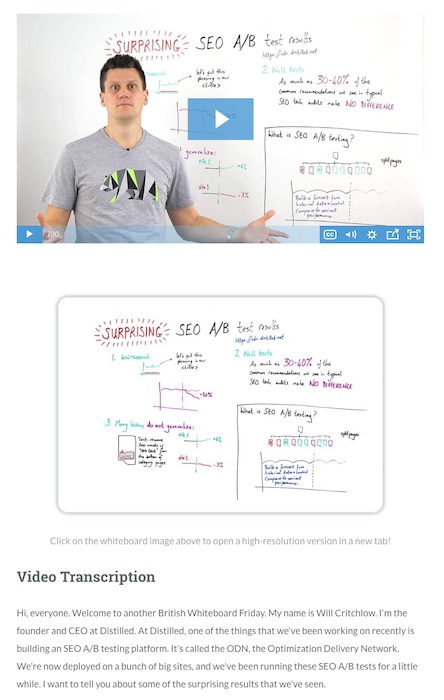
If videos are part of your marketing strategy, then you need to consider how this content gets viewed. Accompany your videos with detailed descriptions or, even better, transcribe your videos. If you’re creating video posts on your blog then transcriptions are the best way to get that content to rank well in Google. Another point to transcribing your videos and podcasts is that not everyone is viewing your content where they can listen to it, for example working in an open office, the library, or taking transit. The ability to empathize with all of the different ways your audience interacts with your site shows a great deal of consideration for your readers. Avoid assumptions when it comes to your content. Create it for the number of different mediums that your audience engages with.

The Visually Impaired and Good SEO
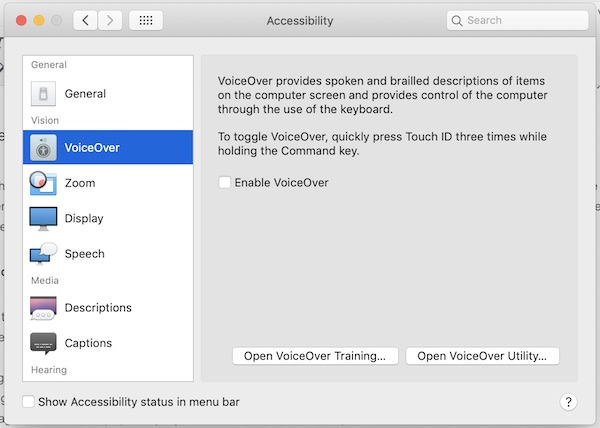
Visually impaired (blind and partially sighted) users make up an estimated 2-4% of the population. That’s roughly 45 million English-speaking people. For these people to access the web, they generally require some sort of voiceover software. If you’re unfamiliar with voiceover software, it dictates the various elements of a webpage to the user.
Everything from the menu items, images, buttons, links, and obviously text are read aloud. So if you haven’t properly described your images with a file name, ALT text, and caption or use excessive menu options, you’re going to make it difficult for these people to access your website.
In an effort to understand the voiceover experience, I switched it on a gave it a go. I was curious to see how visual and textual content was verbalized back to me.
I visited some of my favorite (and least favorite) websites to get a feel for it. Then I tried out our own website. What I quickly realized, and what visually impaired users experience on a daily basis, was that there is a lot to be desired when it comes to accessibility for everyone.

What I experienced
I may be new to the whole voiceover experience, but a few things quickly jumped out at me. Trying to navigate a menu with multiple options and even more submenu items was difficult and slow. A blind user would have to tab through each of the options, while the voiceover dictates until they found their destination. It can be a daunting and tiresome experience.
Here’s what you can do:
- Use descriptive text for menus and headers
- Label clickable elements with descriptive language
- Accurately label form elements
- Name your image files accordingly
- Fill out your image ALT tags with descriptive text
- Keep your on-page links under 75 (especially if you’re not an e-commerce site)
- Minimize pop-ups
Blind people may have a different experience of the online world, but they appreciate the same qualities of a good website as sighted people do; clear, concise language and simple navigation. Creating an inclusive experience takes a level of compassion that is often missing in the SEO world.
Considerations for Colorblindness
Many would argue that this falls under design and your UX designer is the one to worry about this sort of thing. But if you’ve been paying close attention to the SEO industry lately, you would know that usability features play an important role in how well your website ranks in Google.
There are four types of colorblindness: Protanopia, Deuteranopia, Tritanopia, Achromatopsia, which predominantly affects the male population. It’s estimated that one in twelve men have some degree of colorblindness. Whereas an estimated 1 in 200 women have it.

In the digital world, not unlike the offline world, we rely on colors to market our businesses and products.
colorblindness may seem like it wouldn’t affect a person’s interaction with your site, but the way we use color to convey emotion and navigational cues are lost on those with colorblindness. Take this story from 99u about colorblind designers. They live in a world where admitting that they’re colorblind could result in being seen as less capable or worse, losing their job. For the rest of us with normal color vision, we underestimate how much we depend on color for information.
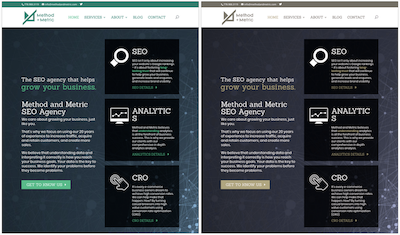
But what does this mean for websites and SEO? If you’re using poor-contrasting colors, nearly 8% of your visitors won’t be able to read your content and may miss key pieces of information. You can test your website out to make sure you’re not using a detrimental color combo.
Here’s what you can do:
- Use high-contrasting colors – Get to know ideal color combinations
- Consider symbols in addition to colors
- Use patterns and textures to show contrast
- Make sure colors don’t convey important information
How do these issues impact your search visibility?
To take a line from this post from Shari Thurow on Search Engine Land,
“Color is a very large part of search-engine-friendly design. Color affects link development. Color affects conversions. And the improper use of color can be considered search engine spam. Color is extremely important to searchers.”
Make it easy for your colorblind users. All clickable elements on a web page should look clickable. If elements on your page don’t look clickable to all users, such as a Buy Now button, then that will have a real impact on your conversions and sales. Not to mention if a user can’t read your website they are going to bounce back to Google’s search results and find a better option. And you don’t want to leave a user with a bad impression of your site. When it comes to considering colorblindness, you will need to work to overcome your own biases of what is you think is clear or self-evident.
Bringing Empathy To The SEO Table
Empathy plays an important role in understanding and relating to your customers. By leaving your website as is you will be excluding an estimated 15% to 18% of your target audience. Accessibility, among other UX elements, factors in greatly into how your website is considered and ranked by Google. And they are working to make the web more accessible to everyone and rewarding websites that create an inclusive experience.
Putting the needs of your audience before your own is key. How will users feel when they visit your website? Will they be confused? If so, why? Try reflecting on the last time you struggled with a website and experiencing that on a daily basis. That frustration should be what drives you to make your website more inclusive.
Creating an inclusive and accessible web experience takes time and consideration. But the payoff is tremendous; happier visitors and improved organic visibility. If you want to appeal and reach as much of your target audience as possible, understanding – and optimizing for – how they interact with your site should be your top priority.

